# Items Widget Styling Walkthrough
This page will guide you through how to customize the React Items widget’s title font size and color.
## Objectives
The goal of this walkthrough is to create a new custom widget based on the React Items widget, with the following properties changed:
- Title font size
- Title color
For a general overview of how to style React widgets, see [How To Style React Widgets](how-style.md#react-how-style).
## Base Widget
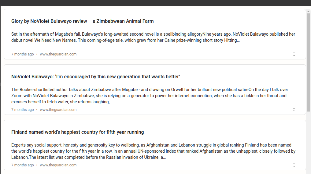
Below is a screen capture of what the Items widget looks like by default:
[](https://s3.amazonaws.com/download.squirro.net/docs/technical/widgets/items-default.png)
## Step 1 - Determine the Components Requiring Styling
To determine the components that require styling, follow the steps below:
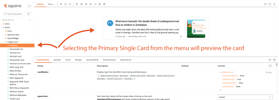
1. Open the [Squirro Storybook](../storybook.md#react-storybook) page and access the Squirro Storybook website.
2. Find the **Items** widget in the left menu.
3. Select **Single Card > Primary**.
[](https://s3.amazonaws.com/download.squirro.net/docs/technical/widgets/items-card.png)
## Step 2 - Use the Controls Menu to Match Configurations
The example Items Single Card shown in Step 1 is configured differently from the example base widget.
Using the **Controls** section, configure the Storybook widget to match the base widget’s properties.
This requires setting the **showThumbnail** and **showAvatar** boolean values to false as shown below:
[](https://s3.amazonaws.com/download.squirro.net/docs/technical/widgets/items-boolean.png)
_Result:_ The preview widget now looks the same as the base widget.
## Step 3 - Identify The Components Requiring Styling
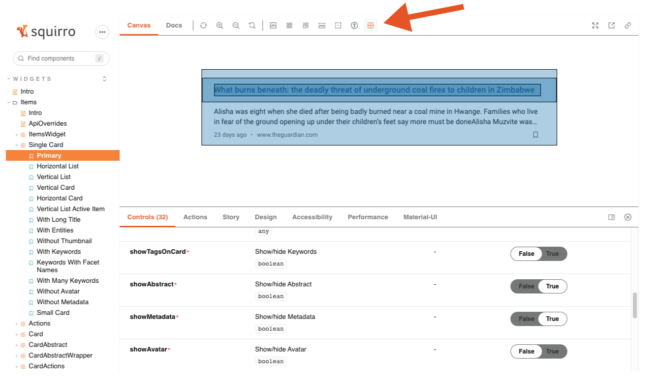
Now that the preview card is configured properly, you can identify the specific components requiring styling using the _Components Inspector_ feature, which you can access by clicking the far-right icon in the top navigation menu, as shown in the screenschot below:
[](https://s3.amazonaws.com/download.squirro.net/docs/technical/widgets/cw-component.png)
With the _Components Inspector_ selected, hovering over the widget will reveal the boundaries of its different components.
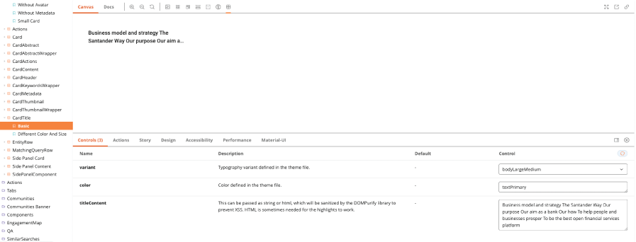
Clicking a component brings up the Squirro Storybook page for that component.
In this case, clicking the title brings up the CardTitle component.
[](https://s3.amazonaws.com/download.squirro.net/docs/technical/widgets/card-props.png)
Under **Controls**, you can see that the `variant` property allows you to modify the CardTitle styling, but none of the variants change the font size _on its own_, which is the goal here.
Knowing that you can’t modify _only_ the font size and color by changing a property value, you must apply custom styling to the CardTitle component.
## Step 4 - Create the Custom Widget File
Your next step is to create a custom widget file in the Squirro Widget Editor.
To do so, follow the steps below:
1. Open your Squirro project.
2. Navigate to **Setup > Visualization**.
3. Click **Custom Widgets** in the left menu.
4. Click the **Plus Icon** to create a new widget.
5. Click the last tab, **React**.
6. Click the **Items** card.
7. Create a new widget named CardTitle.
8. In the editor, create a **New File** and title it `CardTitle.js`.
## Step 5 - Style the CardTitle Component
With your `CardTitle.js` file created, enter the following code to override base styling.
```
const CustomCardTitle = styled(Overrides.Items.CardTitle)(() => ({
fontSize: 20,
color: `#e55100`
}));
export default (props) =>
```
This creates a new variable called CustomCardTitle with a newly-styled title component. The CardTitle component is passed to the _styled_ and the new font size is applied.
The last line of code exports the new component with all the properties passed to it. These properties will always be documented in Storybook. In this example, the `props` object contains `variant`, `color`, and `titleContent` properties.
## Step 6 - Reference The Custom File in Main.js
After the custom file is created, you need to override the default CardTitle with your new one.
To do so, open `main.js` and change the overrides property as shown below:
```
const overrides = {
...Overrides.Items,
CardTitle: Resources.resolved['CardTitle.js'],
};
export default (props) => {
return (
);
};
```
You can verify the styling is working correctly by clicking **Run** in the top-right toolbar of the Widget Editor.
Tip: Clicking **Save** will not preview your changes if you do not first **Run** them.