# Adding Tooltips to Tabs Widget Walkthrough
This page will guide you through how to add a Tooltip to the Tabs widget using Material UI components.
## Create a New Tabs Widget
Start by creating a new Tabs widget in the Squirro Widget Editor with a few tabs as shown in the example below:
[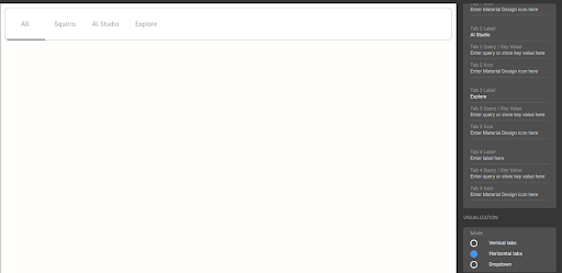](https://s3.amazonaws.com/download.squirro.net/docs/technical/widgets/tabs-example.png)
## Match Configuration in Storybook
Select the **Tabs** widget and use **Controls** to configure the Storybook preview to match the horizontal display within your project.
Next, use the **Components Inspector** and identify the components requiring styling. When **HorizontalTab** is identified, click it to open the component in Storybook.
[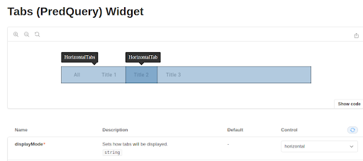](https://s3.amazonaws.com/download.squirro.net/docs/technical/widgets/horizontal-tab.png)
## Identify Properties to Style
With the **HorizontalTab** component open in Storybook, you can see it has a `label` property. This property doesn’t explicitly state it can be used for tooltips, but knowing the property can represent a text or element is sufficient.
[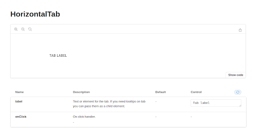](https://s3.amazonaws.com/download.squirro.net/docs/technical/widgets/hz-tab.png)
## Find Components in Material UI
When creating new components or functionalities it’s best practice to check if a component already exists in Material UI.
Going to the Material UI website and searching for _tooltip_ locates a **Tooltip** component.
[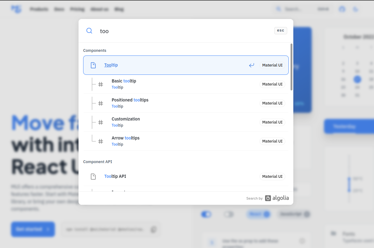](https://s3.amazonaws.com/download.squirro.net/docs/technical/widgets/mui-tooltip.png)
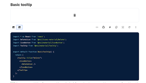
Opening the **Basic tooltip** shows how to use it:
[](https://s3.amazonaws.com/download.squirro.net/docs/technical/widgets/basic-tooltip.png)
The image above shows an example of how the component needs to be wrapped in a `Tooltip` component.
For your **HorizontalTab** component, you must wrap each `label` in a `Tooltip` component.
The tooltip content must be passed as a `title` property to the `Tooltip` component.
### Using Material UI Components in the Squirro Widget Editor
Squirro has preloaded Material UI components in the platform. You do not need to manually import each MUI component.
You can access each Material UI component via the global variable `MUI`.
To use the MUI Tooltip, use: ``
## Create a New Custom File
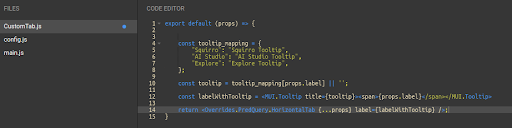
In the example below you can see the labelWithTooltip variable with the Material UI tooltip component spanning the label text.
```
export default (props) => {
const tooltip_mapping = {
"Squirro": "Squirro Tooltip",
"AI Studio": "AI Studio Tooltip",
"Explore": "Explore Tooltip",
};
const tooltip = tooltip_mapping[props.label] || '';
const labelWithTooltip = {props.label};
return ;
}
```
It uses the `label` available in the props (as defined in the Storybook) and wraps it in the tooltip.
In the final return line, the default HorzontalTab component is passed and its label property is overridden.
[](https://s3.amazonaws.com/download.squirro.net/docs/technical/widgets/customtab-simple.png)
Now, you can expand its capabilities by using different tooltips for each tab, as shown below:
[](https://s3.amazonaws.com/download.squirro.net/docs/technical/widgets/customtab-four.png)
## Modify Main.js
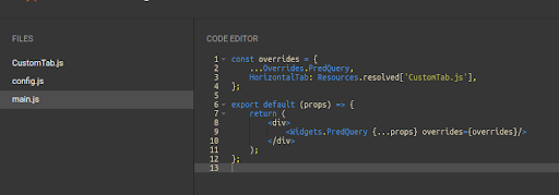
With the custom file created, you can now override the default **HorizontalTab** component in main.js:
[](https://s3.amazonaws.com/download.squirro.net/docs/technical/widgets/customtab-we.png)
## Preview Result
You can verify the styling is working correctly by clicking **Run** in the top-right toolbar of the Widget Editor.
[](https://s3.amazonaws.com/download.squirro.net/docs/technical/widgets/tooltip-finish.png)
Note that clicking **Save** will not preview your changes if you do not first **Run** them.