Dashboard Editor#
The Dashboard Editor is a tool that allows you to build dashboards for end users section-by-section using layers and widgets within a visual editor.
The tool also exposes conditional layers in the user interface based on visibility conditions and options.
Reference: To learn more about visibility conditions, see Visibility Conditions.
This page provides an overview of how the Dashboard Editor works, and how to use it to create dashboards.
Introduction#
Squirro enables you to build both simple and complex dashboards.
Given the number of options, it can be overwhelming for first-time project creators to understand all the concepts and options available when creating their dashboards.
To simplify things, Squirro dashboards are made of components.
There are three primary layout components in a Squirro dashboard, including the following:
Sections
Layers
Widgets
Sections#
Sections are the base-level components when it comes to designing Squirro dashboards.
They serve as containers to place layers and widgets inside and provide the base structure for your layout. The center section is the only required section and will always be enabled. The other sections are optional.
When configuring sections, you have four actions available to you beyond adding layers and widgets:
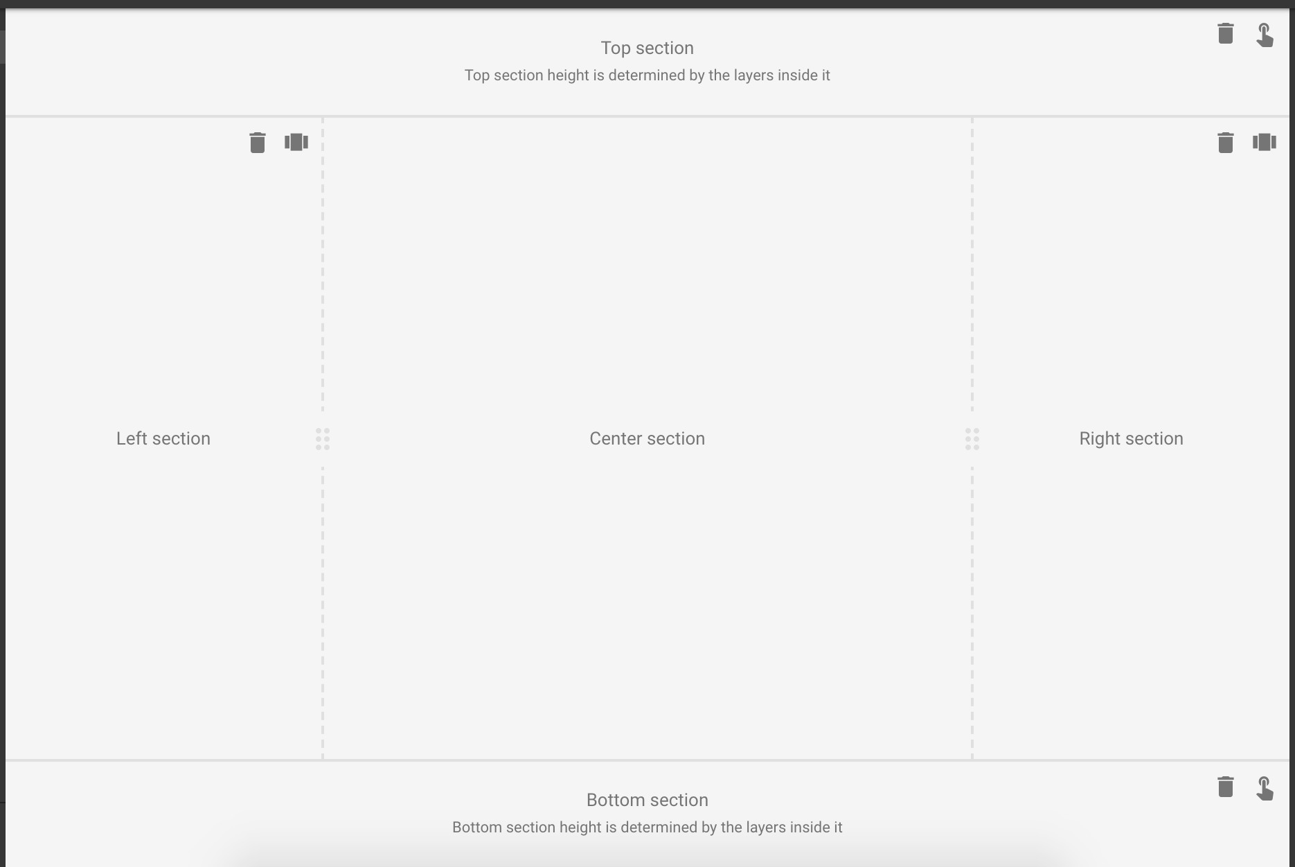
Remove: Clicking on this icon disables the correspondent section.
Scroll Independently: Clicking this will force the content inside the section to scroll independently in case it exceeds the available space.
Pin: This option forces the section to be always visible (pinned) to top or bottom of the dashboard. Pinning is only allowed in the top or bottom sections.
Resizing: In the inner edges of the sections are resizing handles. Dragging this will make the section grow/shrink according to your needs. This is set in number of columns, having a dashboard a total of 48 columns.
Layers#
Layers can be understood as containers for widgets. They help organize your widgets but they are much more powerful than that. It is with layers that you can truly make your dashboard dynamic, in the sense of showing and hiding groups of widgets.
Similar to sections, widgets inside layers also use a 48 unit grid system. This means that you can place and resize widgets to 1-48 columns (where 48 means the widget will use the full width of the section that it belongs to).
Layers can be set to free widget placement, allowing the dashboard designer to place widgets freely in the grid. If this option is not enabled, then widgets will be placed immediately after the previous one, in a top-to-bottom order.
Tip: If you need to create some distancing between widgets, this option will need to be turned on.
When it comes to layer resizing, there are three available methods:
No auto-sizing: The layer will grow to accommodate all widgets inside it, thus creating a vertical scroll bar in case it exceeds the browser height.
Autosize widgets to fit frame: This method will shrink and grow the widgets inside the layer to make sure everything is visible all the time. This comes with a cost if the browser height is too small for the widgets that we want to display. In that case some widgets will not look as well as they should.
Preserve minimum widget size: Allow widgets to grow in height but prevent them from shrinking. With this method, the widget dimensions set in the dashboard editor will be respected. They can grow to fill up the empty space of the dashboard, but if the window becomes too small they will not shrink.
To create a Single Page Application (SPA) experience, layers come with a condition builder mechanism to specify when they will be shown. This is called the layer’s Visibility Condition.
Creating Dashboards#
To create a dashboard, follow the steps below:
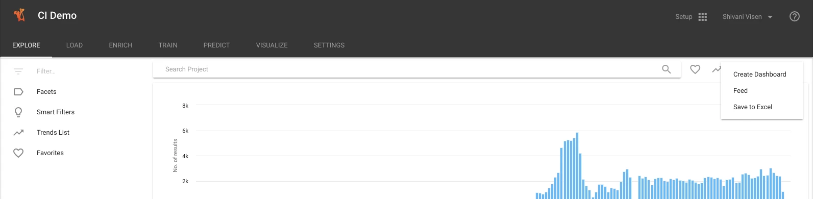
Navigate to Setup ➔ Visualize.
Click on the plusic icon in the top-right corner of the page.

Tip: Alternatively, you can use the More button’s dropdown to create a dashboard from the current search query.
After creation, you are presented with a fresh dashboard where some widgets are put together to give you a head start, along with links to relevant documentation.
Dashboard Editing Interface#
Once you’ve created a new dashboard, you’ll automatically land in the edit mode of the dashboard.
Browsing the editor, note the following:
The navigation bar displays the project name and the dashboard name.
In the center of the nav bar are toggle buttons that allow you to switch between the desktop and the mobile version of the dashboard.
On the right of the nav bar, there is a switcher button that allows you to switch between the Edit and the View mode of the dashboard.
Clicking Exit will exit the editor and takes you back to the list of dashboards.
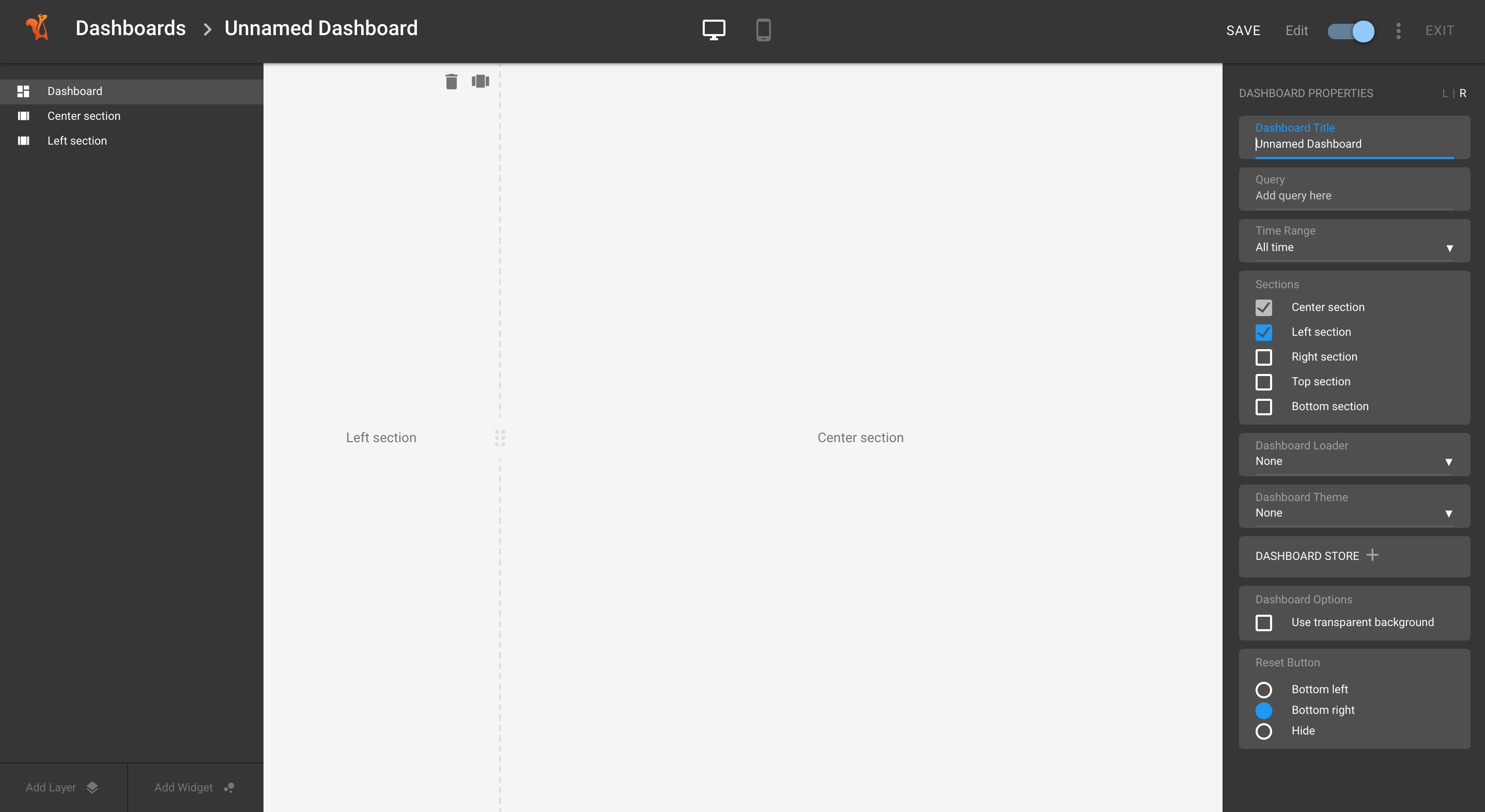
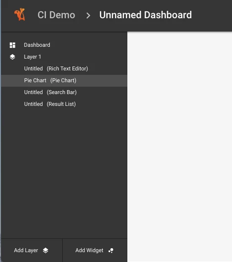
Dashboard Editor Panels#
The dashboard editor consists of two panels, the Tree panel on the left and the Properties panel on the right.
Note the following regarding the Dashboard Editor panels:
The Tree panel lists entities like sections, layers, and widgets, while the Properties panel displays the configuration options to configure the entity selected from the Tree panel.
The properties panel has a L | R button that allows you to switch the positioning of the properties panel to the left or the right of the screen. (The system remembers your preference for the panel positioning.)
The bottom of the Tree panel includes buttons to add a new layer or a new widget to the dashboard.
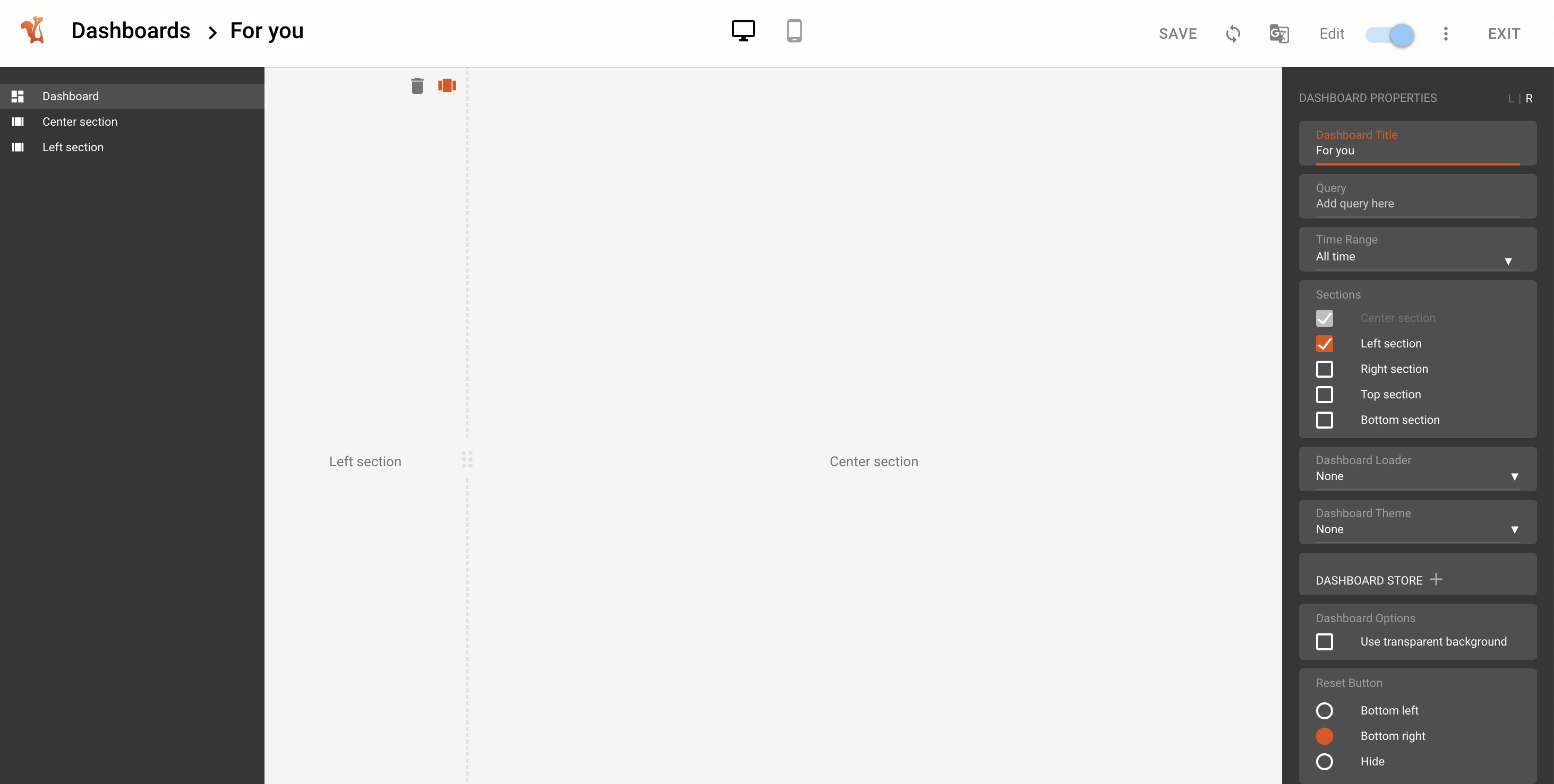
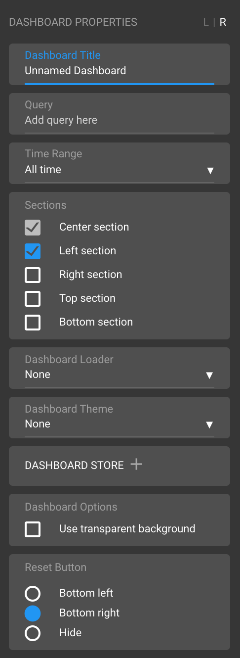
Dashboard Properties#
You can click the Dashboard in the Tree panel to edit its properties.
Here you can configure:
Dashboard title
Dashboard query
Time range (to limit the dashboard results by time)
Sections (center, left, right, top, or bottom)
Dashboard loader and theme loader
Set defaults for the dashboard store
Reset button positioning
Once you’ve finished making edits to the Dashboard Properties, ensure you click Save at the top to save your changes.
Tip: When adding a query to the Dashboard, it can make it easier to have the Explore page open in another tab. The search bar, typeahead, and labels can be used to validate the query.
Reference: To learn more about the Dashboard Store, see Dashboard Store.
Layer Properties#
Click on a layer in the Tree panel to edit that layer’s properties.
Within this panel, you can perform the following actions:
Rename the layer title.
Add visibility conditions to the layer by clicking on the plus icon. This will open a modal where the visibility rules can be defined.

Once the visibility conditions are saved, the layer config. displays a green tick.
Autosize to fit frame resizes all widgets on a layer proportionately on resizing the browser window.
Free widget placement` ignores the fixed spacing between the widgets and allows you to arrange the widgets in any desired layout.
Tip: Hover over a layer in the Tree panel to delete or duplicate that layer.
Widgets#
Squirro is delivered with a large collection of out-of-the-box widgets. Widgets are used to display data and they live inside layers.
To add a widget to a layer, simply drag and drop a selected widget from the widget browser into the appropriate layer.
Every widget has its own set of properties. To learn more, see Widgets.
Widget Properties#
You can edit a widget’s properties by clicking on the widget in the Tree panel.

Tip: Alternatively, you can hover over a widget and click on the edit icon as shown above.
All widget properties are divided into three sections:
The topmost general section where the widget type and the widget title can be configured.
The DATA section, which lists all data configuration-related options including label, number of values, additional widget query, and more.
The VISUALISATION section, where all chart options and other visualisation-related configuration options are listed together.
Note
For developers, there is an additional section called DEVELOPER OPTIONS which exposes general API-related configuration options in the UI.
Widget Browser#
Widgets are the building blocks of a dashboard. Each widget represents data in a particular form. Squirro offers many built-in widgets, such as pie charts, time-frequency graphs (line charts), and word clouds.
Add Widget#
To add a widget, follow the steps below:
Enter edit mode of the dashboard.
Click Add Widget (located at the bottom of the left panel).
Result: This opens the widget browser panel on the left where widgets are listed in functional categories.
Scroll the browser to find a widget or use the built-in search functionality to search for a widget.
Drag and drop the widget to the desired location on the dashboard. You can add as many widgets as you want in one session as long as the widget browser is open.
Click Close at the bottom of the browser when finished.
To save the changes, click Save at the top right of the nav bar.
Move Widget#
To move a widget, follow the steps below.
Enter the edit mode of the dashboard.
Hover anywhere over the widget to display drag handlebars.
Drag the widget and drop it at the desired location.
To save the changes, click Save at the top right of the nav bar.
Duplicate Widget#
To duplicate a widget, follow the steps below.
Enter the edit mode of the dashboard.
Hover anywhere over the widget to display the menu.
Click the duplicate icon.
To save the changes, click Save at the top right of the nav bar.
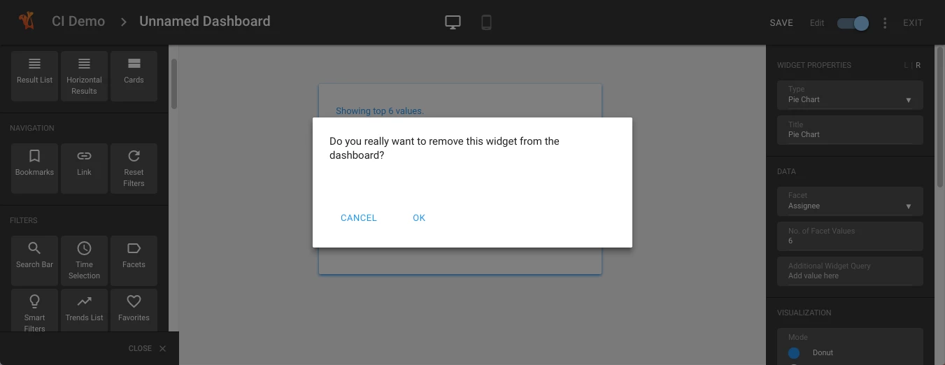
Delete Widget#
To delete a widget, follow the steps below.
Enter the edit mode of the dashboard.
Hover anywhere over the widget to display the menu.
Click the delete icon.
Confirm the deletion.
To save the changes, click Save at the top right of the nav bar.
Embedding and Sharing Dashboards#
To share or embed the current dashboard, click the Dashboard Setting Button and select Share Dashboard or Embed iFrame.
The Embed iFrame offers an iframe HTML tag, which can be used for embedding the dashboard in a third-party site or application.
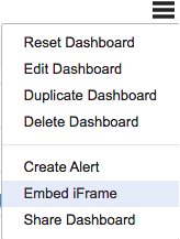
Note: The Share Dashboard option provides a URL, which can be easily shared via email or other means.
Dashboard URL API Reference#
The URL which is generated by the Embed and Share options in the dashboard can be extended with additional options.
These URL parameters interact with the dashboard state system, which manages selections, queries, and filters. When parameters are provided via URL, they are parsed and converted into dashboard selections that appear as interactive chips in the search interface.
Reference: For detailed information about dashboard state management, see Available React Hooks (useDashboardState section).
The following URL parameters can be used to change the behavior of the dashboard:
Parameter |
Description |
Example Value |
|---|---|---|
query |
Override the Dashboards search query. |
&query=(blue OR green OR red) |
selection |
Set the Foreground query for all Significant Terms widgets |
&selection=blue |
created_before |
Only display results with a created_at value lower than this |
&created_before=2014-12-31 &created_before=2014-12-31T18:30:00 |
created_after |
Only display results with a created_at value higher than this |
&created_after=2012-12-31 &created_after=2012-12-31T18:30:00 |
relative_start |
Only display results with a created_at value higher than this, in relative terms to today |
&relative_start=2y &relative_start=8w |
relative_end |
Only display results with a created_at value lower than this, in relative terms to today |
&relative_end=1y &relative_end=4w |