Squirro Storybook#
This page provides an overview of Squirro Storybook, a components library Squirro uses to document and test widgets and components.
Squirro Storybook is the reference for the latest versions of all Squirro React widgets and components.
Structure#
The Squirro Storybook site contains three primary areas:
Widgets: available React widgets.
Components: universal widget components.
MUI Modifications: custom modifications applied to the Material UI library, including custom Squirro design elements such as colors and typography.
Note: Whenever a component has Wrapper in the name it represents a spacing-only component.
Most Popular Features#
This section shows some of the most popular features for creating custom React widgets.

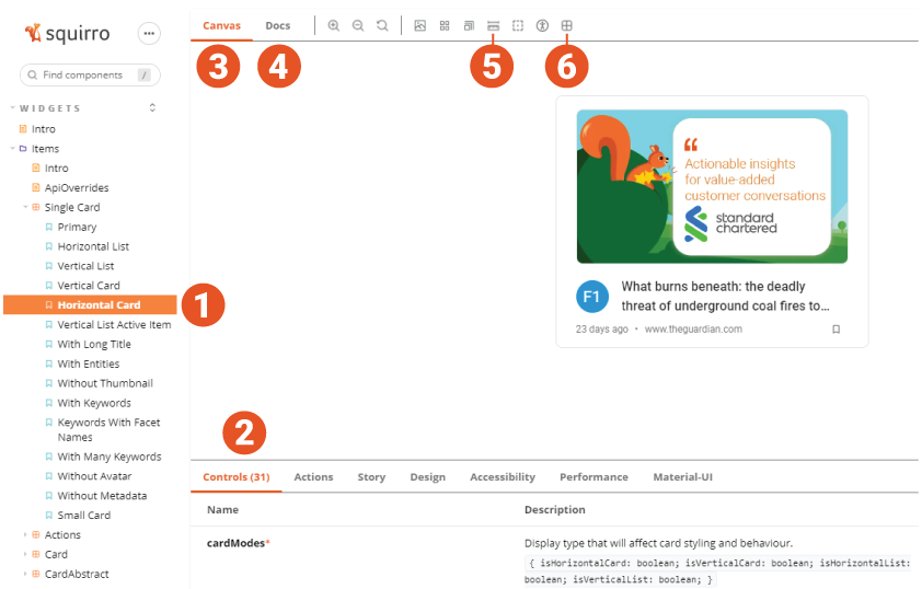
The numbers on the screenshot correspond with the numbers in the text sections below.
Component list: Primary components are listed at top, with variations listed below. These are the same components but with different default props. You can change props yourself in the Controls or Docs tabs to get the same result.
Controls tab: Graphical UI to interact with a component’s props dynamically. Each property will have a description, type, and control. When you override one of the components, it will still receive these props from the container and be accessible while creating a new one.
Canvas tab: Main tab that shows the component and toolbar with controls at the bottom.
Docs tab: Similar to the Canvas tab, it shows component and toolbar with controls at bottom as well.
Enable measure: When activated, it enables you to inspect elements sizing and spacing, which can be useful when matching stying on new components.
Overrides inspector: When activated, it enables you to inspect overridable components.
Overrides Inspector#
Overrides inspector, when activated, allows you to hover over a component and see its name. When clicked, it takes you to the Storybook page for that specific component.
It also shows you the component’s parents in a lighter blue color.
This allows you to find the component you to override based on the widget UI template.
CardAbstract Example#
In the example below, once you override the Card component, you need to render CardApstractWrapper and CardAbstract as the Card component is their parent. (The blue component background is not visible in the screenshot below but it will be visible in the Storybook.)

