Customizing React Custom Widgets#
This page provides an overview of customizing Squirro React widgets.
Component Structure#
Squirro allows you to customize out-of-the-box React widgets by overriding default components, functions, and callbacks.
Accordingly, React widgets are built using a container components and visual components approach.
This architectural pattern separates logic and functionalities from styling and HTML structure.
Container Components#
Containers are components concerned with how things work.
They contain all logic, state, and methods. Useful hooks and methods are exposed separately via Squirro APIs (Learn more).
Containers are entry points for creating a new widget.
You will pass all components and props to the container. These containers are available in the globally scoped Widgets variable.
The example below initializes the Items widget by passing default props to the container:
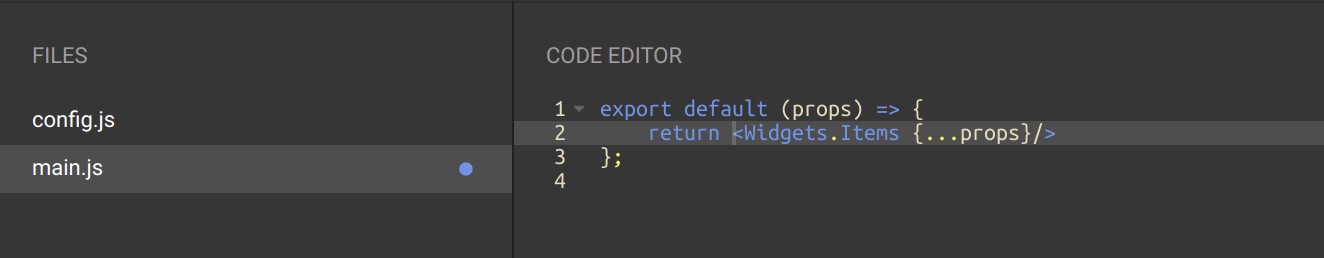
In this example, you get the default version of the Items widget.
Overriding Containers#
Note that by default, you cannot override the container itself.
You can only override the parts exposed through the Widget API governing this container component.
You can find further details on methods on the API Overrides page in Squirro Storybook.
Visual Components#
Visual Components are concerned with how things look.
They are purely visual, meaning they don’t contain any states or methods. All data, states, and callback methods are received via their parent container.
They are all documented in Squirro Storybook.
You can use components to override default widget styles, HTML, and positioning. Only the parts of the widget being customized require overriding.
Example Items Widget Customization#
The Items widget contains multiple components, including CardTitle, CardAbstract, CardActions and more.

To add an additional action icon to the footer of a card, you can override the component named CardActions and add an additional icon.
Structured this way, all future frontend updates to the Items widget will also be applied to your custom widget, excepting overridden the actions component.
Overriding Components#
Every widget container receives its components via the overrides prop.
Overrides contain an object with React functional components represented by the component key name.
Below is an example Overrides components object for the Items widget:
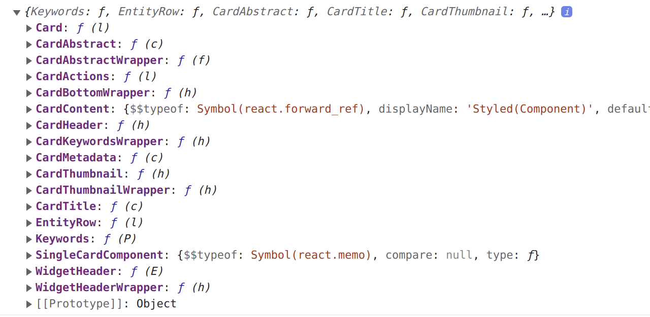
Default components for each widget are available in the globally scoped variable Overrides.
All overridable components are separated per widget name key.
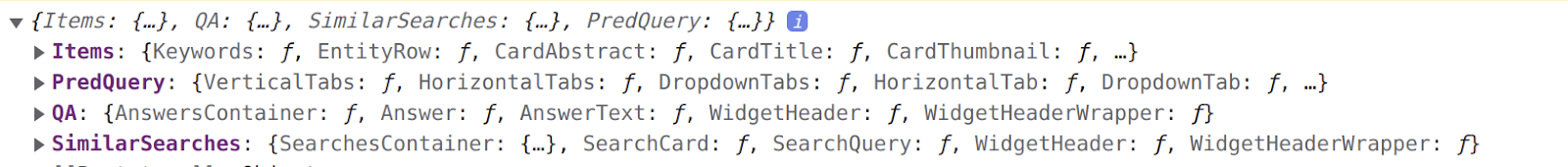
The following is an example overrides object containing four different widgets:
Example Items Widget Override#
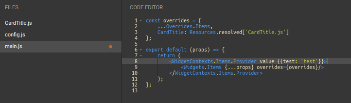
When creating a new custom widget based on the Items widget, you must pass down the Overrides.Items as an overrides property to Items widget.
See below for an example where the new overrides object takes all default overrides for the Items widget. Only the WidgetHeader component is replaced with a new, custom component.
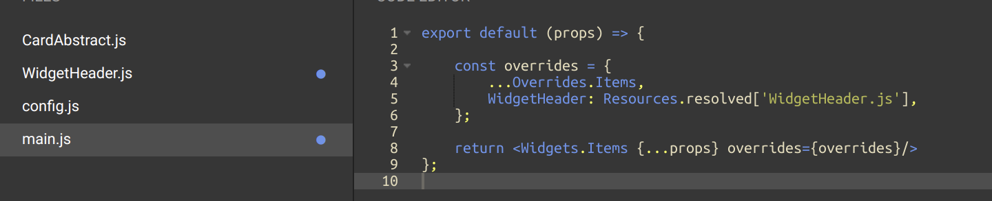
When the new WidgetHeader component activates it receives the same props as the original WidgetHeader. As a reminder, all callbacks, states, and other components are received from their parent Container for use in your new component.
Props for each component are documented in Squirro Storybook.
Overriding Widget Callbacks and Functions#
The most useful callbacks and functions for each widget can be overridden. You can do this by passing a newly created function inside apiOverrides widget parameter.
The example below shows an override of onCardClick for the Items widget. As the name suggests, this callback is called when you click on a card:
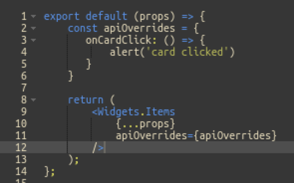
After making the change, clicking on the card will show an alert instead of the Item detail.
Every apiOverride method will pass the original method and its arguments as a prop, which means that you can call the original callback together with your custom code:
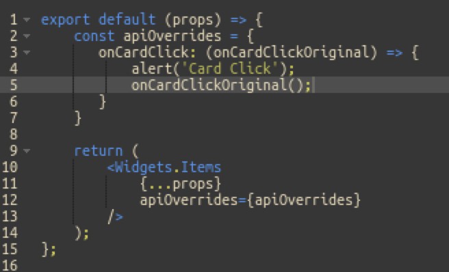
This can be very useful if you don’t want to remove default functionalities, but rather add something new to it.
Every widget will have API overrides documented inside Squirro Storybook.
Accessing Widget Data#
When creating a new widget, the props of the widget will contain the widget configuration model, dashboard state, nlpSearch, and other parameters which you can use inside of main.js.
However, these props will not be available inside of the custom components. These components will only receive props used in the original component and already documented on Storybook.
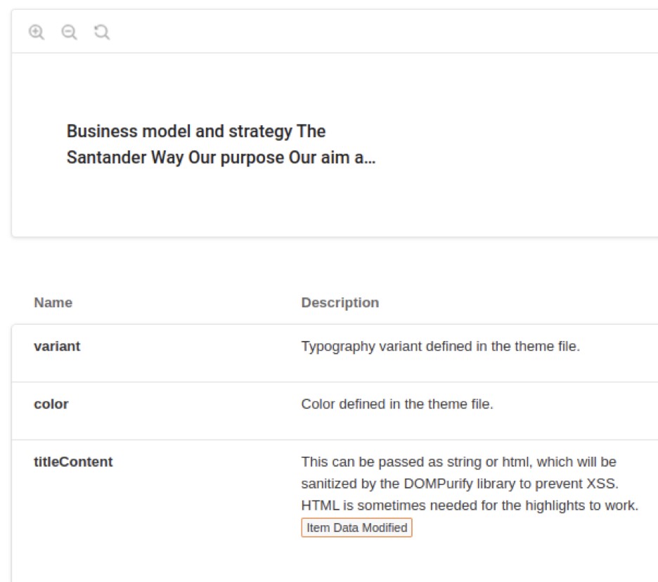
In the example below, the CardTitle component receives only the three following props:
Variant
Color
titleContent
But what if you want to create a new title component that shows an abstract instead of the title? By default, you don’t have access to Items’ abstract text.
This is where React Context comes into play.
React Contexts#
Two contexts are available for each component:
WidgetContexts
ModelContexts
To learn more about contexts, see the official React Context page.`
WidgetContexts#
Widget context is a React context available in every widget. It contains all data and state values available. This includes collection data, loading state of collection, error messages of the collection, and widget configuration, amongst others.
Widget context can be accessed inside any component via React.useContext hook, as shown below:
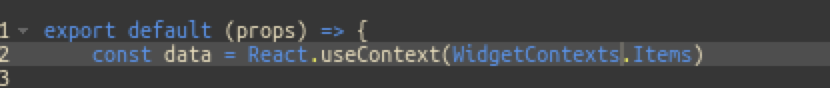
It contains contexts for each widget, requiring you to specify the context for the individual widget you are overriding. (In the example above, Items widget context is specified.)
You can also add additional data inside WidgetContext. This data will be available to all other components used in your widget. This allows you to exchange data between components and stay current with data changes.
ModelContexts#
Model context is available only in some widgets using Items collections. It contains data for each model individually.
In contrast, WidgetContext contains the whole collection.
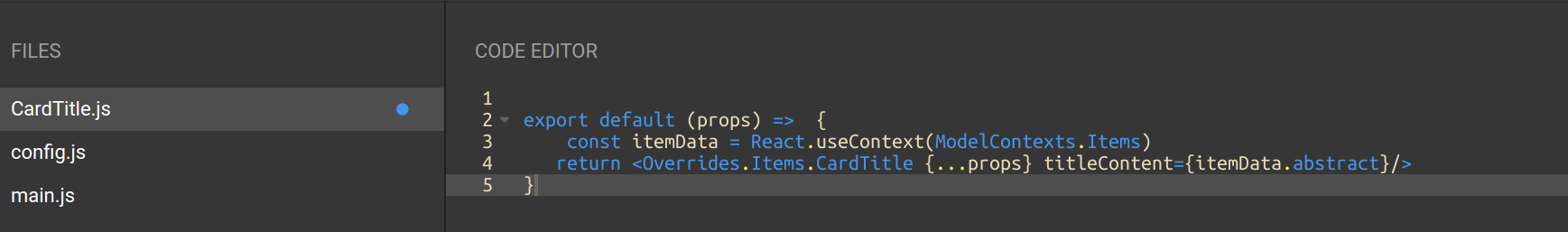
If, for example, you want to use the abstract text of the current item, you must find a correct model in the collection. This cannot be done without an ID.
This is why ModelContext only contains data for the current Item. A good example would be if you wanted to show abstract text instead of the title in the CardTitle component as shown below:
Sharing New Data Between Components#
Widget context can also be used for adding new data. For example, if you want to share the state of the new component with other components.
This is useful when you want to respond to changes from a different component.
WidgetContext has a function called setCustomProps and a property called customProps. It works the same as React.useState setter and getter.
With setCustomProps, you can set new properties and these will be available inside customProps, which can be accessed inside any other component.

Adding Data to the Widget Context Inside the main.js File#
To pass down data from the main.js file, a different approach is needed than the method outlined in the previous section. This is because the setCustomProps function can only be utilized within widget child components.
The solution is to use a widget context provider component and pass the data as the value. This will make the data accessible via the mainJsProps property of the context object, as shown in the example below:
If you now log the context value within the widget components, the mainJsProps property will contain your data, as shown in the example below:
Accessing Dashboard State#
The dashboard state is available in widget props and in the Globals object in custom widgets. Use the Hooks.useDashboardState hook to interact with dashboard selections, queries, and filters:
// In main.js
export default function MyCustomWidget(props) {
    // Use the dashboard state hook
    const store = Hooks.useDashboardState({
        dashboard: props.dashboard,
        dashboardState: props.dashboardState,
        widgetModel: props.widgetModel,
    });

    // Add facet filter
    const handleAddFilter = (facet, value) => {
        store.addFacets([[facet, value]]);
    };

    // Get current selections
    const currentSelections = store.selections;

    return (
        <div>
            <div>Active filters: {currentSelections.length}</div>
            <div>Current query: {store.getQuery()}</div>
            <button onClick={() => handleAddFilter('category', 'news')}>
                Add Filter
            </button>
        </div>
    );
}
For custom widgets that need to create their own dashboard state instance (eg. for collections that need specific query management), use Utils.createDashboardState:
export default function MyCustomWidget(props) {
    // Create dashboard state if not provided
    const customDashboardState = Utils.createDashboardState({ dashboard: props.dashboard });

    const store = Hooks.useDashboardState({
        dashboard: props.dashboard,
        dashboardState: customDashboardState,
        widgetModel: props.widgetModel
    });

    // ... use store methods
}
Reference: For complete dashboard state API documentation, see Available React Hooks (useDashboardState section).