How To Style React Widgets#
This page provides an overview of how to style React custom widgets using Squirro Storybook and the Emotion library.
Quick Summary#
To style React custom widgets, perform the following steps:
Locate your widget or component on Squirro Storybook.
Use Control to set the widget or component properties to achieve your desired look and functionality.
Use the Inspector Tool to identify components requiring styling.
Create your custom widget JavaScript file in the Squirro Widget Editor.
In your new file, override the styles of the original component.
In the
main.jsfile, reference your new component in the overrides object.
Locate Your Widget or Component on Squirro Storybook#
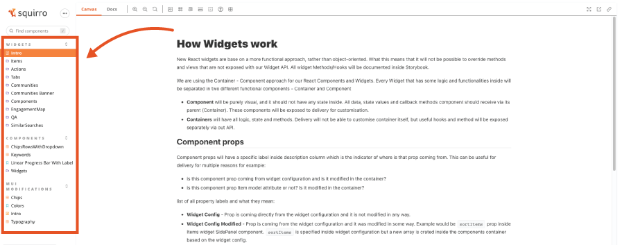
All Squirro React widgets and component styling information can be found in the Squirro Storybook page.
Locate the custom widget or component you plan to customize or browse available widgets and components to find the best base for your custom widget or component.
The left navigation menu shows all available elements grouped in the following categories:
Widgets
Components
MUI Modifications
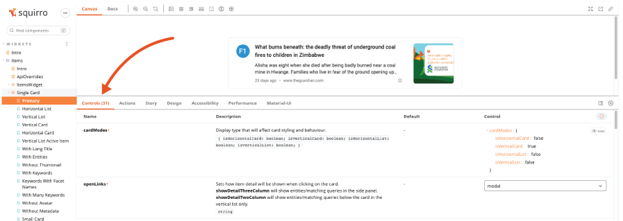
Using Controls to Set Widget or Component Properties#
Once you’ve identified your widget or component, modify its properties to match your project configuration as needed.
To do so:
Click the widget or component name in the left navigation menu.
Change parameters within Controls as needed to match your project configuration.
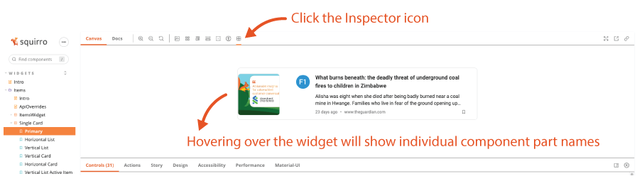
Determining Elements Requiring Styling Using the Inspector#
After modifying the widget or component properties, you can use the Inspector to identify the components requiring styling.
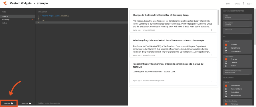
Creating a Custom Widget File in the Squirro Widget Editor#
Once you’ve identified the components requiring styling, you can create your custom widget .js file in the Squirro Widget Editor.
To do so, follow the steps below:
Open your Squirro project.
Navigate to Setup > Visualization.
Click Custom Widgets in the left menu.
Click the Plus Icon to create a new widget.
Click the last tab, React.
Click your widget type.
Enter the widget information and click Next.
Click New File in the bottom left corner.
Enter the filename (including
.js) and click Next.
Overriding the Styles of the Original Component#
Inside your new custom file, you can now override the components you previously identified in Storybook.
You can style your components using the styled variable available in the global context.
For more details on styling React widgets, see Styling React Components.
Referencing Your New Custom File in Main.js#
Once you’ve created your custom file, you can reference it in the overrides object.
Once saved, the styling will be active within your project.