Visualizing Communities#
Profile: Project Creator
The Squirro Dashboard Editor provides flexible ways of visualizing communities using widgets.
This page describes the ways communities can be visualized within your project.
Project Creators can modify the dashboards and widgets that contain community visualization options. End users can follow and unfollow communities.
Dashboard Editor and Widgets#
Communities information is displayed to users via widgets contained within Squirro Dashboards.
These are modified using the Squirro Dashboard Editor.

There are four ways to visualize communities using widgets in the Dashboard Editor, which includes:
Tabs widget, with Show user Communities selected.
Communities Items widget (formerly the Communities Headlines widget)
Communities List widget
Communities Banner widget
The following sections describe how to add and configure each widget type.
Tabs#
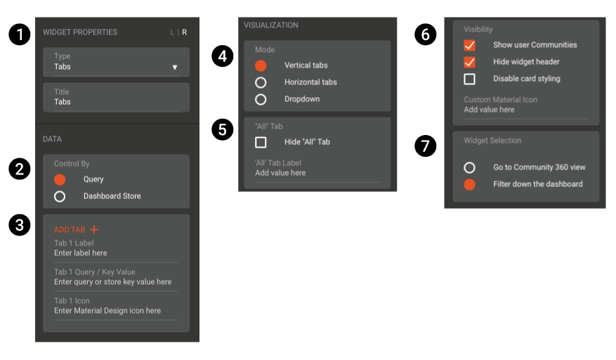
You can use the Tabs widget to display a list of the communities the user follows.
Important: In the widget properties, you must select Show user Communities under Visibility for the Tabs widget to function as a communities widget.
See the screenshot and associated description table below for an overview of the Tabs widget.

Number |
Property |
Description |
|---|---|---|
1 |
Widget Properties |
Allows you to change the type of widget and set the widget title. |
2 |
Data - Control By |
Here you can set the widget to respond to Dashboard Store or query inputs. For most use cases, you’ll want the widget to be controlled (i.e. filtered) by query. |
3 |
Data - Add Tab |
This section is not relevant when the widget is used to display communities. Ignore. |
4 |
Visualization - Mode |
Dictate how the widget will display: as vertical tabs, horizontal tabs, or a drop-down menu. |
5 |
Visualization - “All” Tab |
You can choose to show or hide the All tab and replace the title All with a custom title if desired. |
6 |
Visibility |
Show user communities must be selected for the Tab widget to show communities. You can also choose to show or hide the widget header title and enable or disable widget card styling. |
7 |
Widget Selection |
When clicked, you can choose to have the widget filter the dashboard results or take the user to the selected community’s Community 360 page. |
Community Items#
Note: The Community Items widget was previously named Community Headlines, and you may see it referred to as such within your project or in screenshots. They are functionally the same widget.
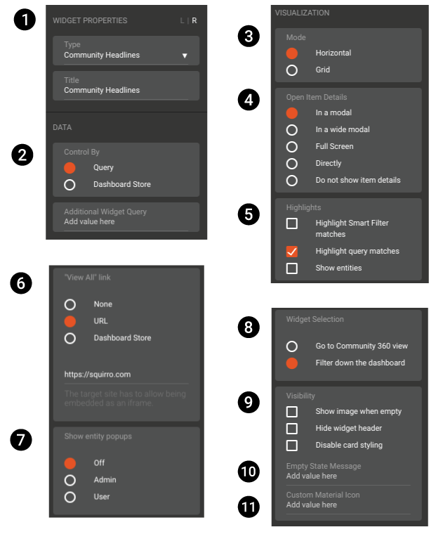
The Community Items widget displays documents as individual cards in a feed. You can scroll through documents using the arrows, or click a card to interact with it.
See the screenshots and associated description table below for an overview of the Community Items widget.

Number |
Property |
Description |
|---|---|---|
1 |
Widget Properties |
Allows you to change the type of widget and set the widget title. |
2 |
Data - Control By |
Here you can set the widget to respond to Dashboard Store or query inputs. For most use cases, you’ll want the widget to be controlled (i.e. filtered) by query. |
3 |
Visualization - Mode |
Dictate how the widget will display: as vertical tabs, horizontal tabs, or a drop-down menu. |
4 |
Visualization - Open Item Details |
Select how the item detail is displayed when an item (document) card is clicked. |
5 |
Visualization - Highlights |
You can choose to highlight matching query text within the document or matching entities (labels). |
6 |
Visualization - “View All” Link |
Change the behavior of the widget when the “View All” text is clicked. Note that hyperlinks must include |
7 |
Visualization - Show Entity Popups |
If your project uses Machine Learning (ML) entities, select who is shown the entity popups used to provide feedback. |
8 |
Widget Selection |
When clicked, you can choose to have the widget filter the dashboard results or take the user to the selected community’s Community 360 page. |
9 |
Visibility |
Select different visibility conditions for the widget. You can also set custom messages for when the widget is empty and set a custom material icon. |
10 |
Visibility - Empty State Message |
Set a custom message to show when there are no communities to show. |
11 |
Visibility - Custom Material Icon |
You can add a custom material icon to the widget by entering a material icon name. |
Community List#
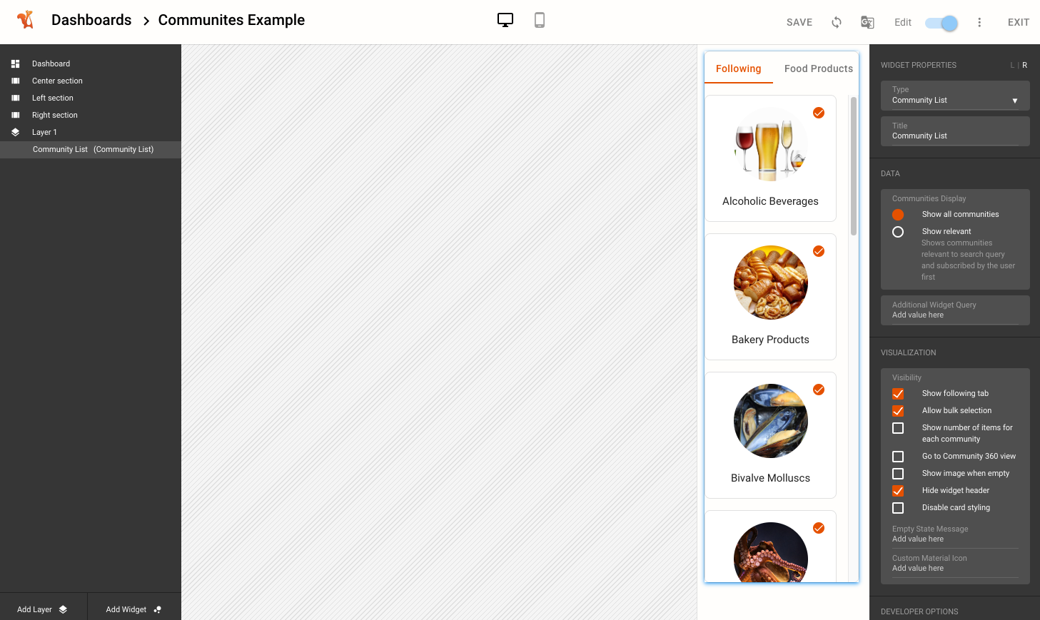
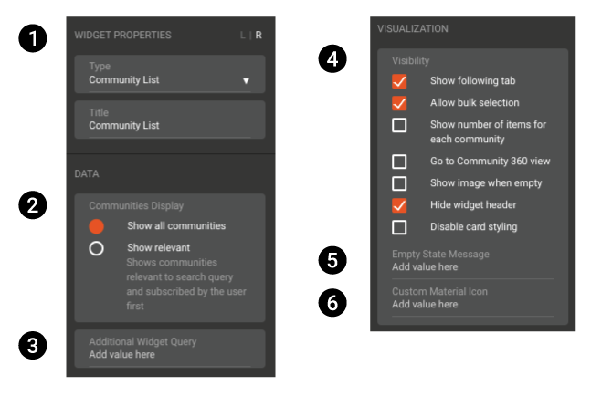
The Community List widget allows users to follow and unfollow communities by clicking the plus or tick icons respectively.
See the screenshot and associated description table below for an overview of the Communities List widget.

Number |
Property |
Description |
|---|---|---|
1 |
Widget Properties |
Allows you to change the type of widget and set the widget title. |
2 |
Data - Communities Display |
Here you can set the widget to show all communities, or only show relevant communities (to the search query). |
3 |
Data - Additional Widget Query |
You can add additional labels or query filters to the widget here. |
4 |
Visualization - Visibility |
Select from several visualization options, including whether to show the Following tab, allow or disallow bulk selection by the user, an more. |
5 |
Visualization - Empty State Message |
Set a custom message to show when there are no communities to show. |
6 |
Visualization - Custom Material Icon |
You can add a custom material icon to the widget by entering a material icon name. |

